
Bloom Juice Co.
Live now!
An online store experience designed for the health conscious group to order & enjoy delicious farm grown organic beverages and eateries.
01 Project Overview
Client
Bloom Juice Co.
Industry
Health & Wellness
User & Audience
The audience is a health conscious group composed of two generations. The Millennial group (25 - 38) and the Gen X group (39 - 54), according to the Pew Research Center.
Duration
4 Months
Role & Responsibilities
UX Designer
Wireframe & Interactive Prototyping
Brand Mark Redesign & Style Guide
Asset Design
Design Tools
Figma
Adobe Illustrator
Adobe Photoshop
Site Development
Jeff Harrison (WIX)
02 Problem
Bloom Juice User Research for web and mobile experience
Problem
Failing and newly acquired organic cold pressed juice business struggled in a billion dollar industry. Adoption rates for both web and mobile user experience were at an all time low.
-
Web visitors = 11% Adoption
-
Mobile visitors = 23% Adoption
Users either figured out where to order or had to reach the physical stores for directions on how to order for both web and mobile.
In addition, often user orders were lost once they were placed. The former owner had all web & mobile orders routed to a business email where orders would often be missed within the clutter of business and spam emails.
-
8 Orders lost in 1 month
03 Discovery
Usability test
After a pilot test I discovered a couple of concerns:
-
No CTA in relation to the product offerings. In other words, after finding the product of interest I didn’t know how to order it since there was no invitation to order or add it to my cart. When I finally did locate where to order I learned it was located outside and away from the product it self in another page.
-
Another concern was the amount of information on each product offering. It was rich in information on every ingredient used and it’s effect on your health. This was great if you have the time for a novel to read, but realistically speaking this would be a hard sell in a world full of people with attention spans of 2sec or less.
-
My third and final concern was the over all experience on both web and mobile. Felt like at every turn there was a challenge to meet. It gave me the impression of an imploding business designed to fail and not to service its users.
User testing & Learnings
Thanks to the 8 volunteers that agreed to have their user experiences recorded for the purpose of creating a better experience for both web and mobile, we learned the following:
-
Lots to read. They just want to make sure it’s organic.
-
When users try to order they have to scroll past all the rich information, all the way to the bottom hoping they find the CTA (Buy now/Add to cart), but can’t find it.
-
A few users have had to call the store after placing their orders via mobile to see if their orders were received since some previous orders have been lost.
04 Pain Points
Information Overload
"I just need enough information to make a decision"
No CTA
"I can’t locate the Buy Now button"
Lost Orders
"Why is the store not able to receive my orders?"
05 Personas
User personas
During testing (and online market research) we identified two types of users, GenX and Millennials.

Lindsey
Millennial
Age: 25
Occupation: Social Media Assistant
Character type: Liberal
Values
-
Healthy products
-
Organic ingredients
-
Friction-less experiences
Bio
Single young lady who attends yoga class often. Enjoys sweet organic food and beverages. She prefers a mobile experience over an online one, because it’s easier access. Doesn’t care for challenging navigation, but rather quick and friction-less.

Susan
Gen X
Age: 45
Occupation: Product Manager
Character type: Skeptical
Values
-
Healthy products
-
Organic ingredients
-
Friction-less experiences
Bio
Wife, Mother of two, and Career professional. Enjoys organic food and beverages. Organic ingredients and service is a must. No preference when it comes to online or mobile experiences. Doesn’t care for challenging navigation, but rather quick and friction-less.
06 Problem statement
Due to poor navigation, information overload, and a bad order management system, we have failed to satisfy the needs and expectations of our users. We need to respond with a friction-less experience that can be accepted by our users and consequently increase the adoption rate.
07 Solutions
Pain points
-
Information overload
-
No CTA
-
Lost orders
Solutions
-
Only list ingredients & benefits
-
A "Buy Now" + "Add to Cart" (CTA) will accompany each product ffering
-
Create an order management system
08 User Workflow
Workflow steps
The new user experience will provide a streamline approach to ordering. Users will easily be able to locate products quickly and add them to their cart and checkout. In addition we’re accounting for returning users and their workflow route, as they will be versed in the product of their choosing and therefor skip the product details step and “Add to Cart”.

08 Task diagram
Web + Mobile Task diagram
The user task flow illustrates the user steps and decisions to complete a product order.

Order Management Task diagram
The order management task flow illustrates the user steps and decisions to receive and complete a product order.

10 Wireframing
Web + Mobile
These wireframes show the visual idea and functionality of the new web and mobile experience.
Home


Product Menu


Product Detail


Cart


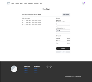
Checkout

Order Management Dashboard (CRM)
The wireframe shows the visual idea and functionality of the new in-store order capture system, designed for employees to manage.


11 Brand Style Guide
Style guide
A style guide was created detailing the look and feel of the new rrevised brand mark and it’s supporting forms of communication. Below is a snipet of the prime elemenets utilized in the web, mobile and dashboard experiences to carry a consistent form of design.
Brand Mark
Font
Avenir Next
ABCDEFGHIJKLMNOPQRSTUVWXYZ
0123456789
abcdefghijklmnopqrstuvwxyz
0123456789
Primary Colors
Supporting Colors
12 Prototype
Before
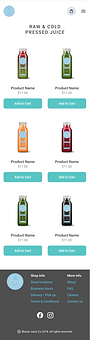
A look at the previous Bloom Juice web design. Great products, but rich in product information, dated, no CTA's, and poor product order collection system.
Home Page

Product Page

After
After conducting user testing, reviewing, and iterating on our learnings we were happy to move forward into high fidelity web and mobile surfaces.
Home


Product Menu

Product Detail


My Cart


Checkout


Order Management Dashboard (CRM)
After, “on the job” user (employee) testing and learnings, we iterated on those learnings and improved the order management system to satisfy both the needs of the users and shareholders.


13 Testing & Results
Web & Mobile Results
Despite loosing a lot of users to the former mobile and web experience, Eng was able to perform an A/B user test for 30 days and the response rendered amazing results:
-
Web visitors rendered a 62% increase vs. 11% from the old design = 73% total adoption
-
Mobile visitors rendered a 78% increase vs. 23% from the old design = 101% total adoption
-
In 30 days we were able to see a combined total adoption rate of 174% vs. 34% from the old design.
Assumptions & Results
Our assumption to place a CTA on each product and consolidate the product information to a consumable amount was validated.
-
100% Visitors reported to easily locating product CTAs visually
Our assumption to create a CRM to manage user orders and decrease order loss was validated.
-
Zero (0) orders were lost vs. 8 orders lost in the previous month before the new CRM.